Google analytics is free but it's not giving me the answers I want quickly and cleanly. By chance, I came across Oribi. They got it right guys. THEY GOT IT RIGHT. Each day, I need to know what blog posts are working well, what specific part of the post is working well, what brings real leads to our product. Oribi tells me this because they finally figured out the whole 'events' thing. They figured out that I don't give a damn about events. I want answers.
Related: How to do SEO When You Hate SEO
Also see: Why Serial Entrepreneurs Work on Go-to-Market Strategies First
Resource links: Oribi Analytics for Content Marketing
What's the problem with Google Analytics at present?
I've used Google Analytics for a while and I only know 10% of it.
You can do a Phd in Google Analytics and still not figure it all out.
It takes 10 clicks to get anywhere.
Where is our traffic coming from?
I have to go to Analytics > Acquisition > Source / medium > Show more rows...
I click 10 times more to understand how 1 specific blog post is doing.
Look at their behaviour flow. I go nuts clicking that to figure out what's happening.

I'm not getting the answers I want to the questions I care about at the speed I need.
I needed an AI smart joystick with 2 buttons and they gave me a manual traffic control tower with 5,000 buttons.
As a content marketer, what do I want answers for?
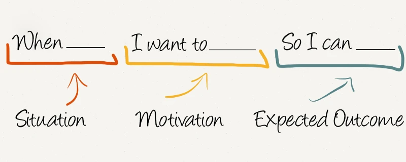
I'm going to use the 'jobs to be done' formula for explaining the answers I'm looking for.

This framework cuts out the bullshit and gets to the core of what I need.
There are 4 things I want answers for...
1. Which links, on my best blog posts, do people most often click on?
When I want to see what is the most clicked link in my blog post...
I want to see a list of the links in that post and how many times each is clicked...
So that I can edit the order of the links to bring more people to our own website.
Below is a screen shot of our 25 Companies Show You Their Best SaaS Pricing Model blog post.
It's a roundup of 25 SaaS pricing pages presented in a big long list with notes and pictures.
There are a lot of links. Which one do you think gets the most clicks?
(note: We recently edited this post to add our own pricing post at the top)

This is what Oribi shows me.

If you think users open this blog post and click on the first 2 or 3 links... you'd be wrong.
The most clicked link is list item 12 and the second most clicked is right at the very bottom of the list.
2. Which of our blog posts is the best at bringing people to our home page?
When I want to see which article is effective at bringing people to our home page...
I want to see a list of those articles and what % click through to the home page...
So that I can publicise the best articles more by adding them as links to other posts.
Below is the Oribi table showing how many people came to HelloScreen in the last few days, via each blog post.

It's no surprise that '9 hacks' is at the top because Upscope is listed as one of the hacks.
Adding your product as a good relevant hack in a well researched list is a winner.
Thank you Oribi for reminding me of this.
3. Which topic brings people to our blog?
When I want to see how many people come to our 'Intercom' related blog posts...
I want to see a list of all our main topics and how many people come to each one...
So that I can prioritise which topic to put more work into.
Below, look at the 3 topics to the right. Intercom, onboarding and SaaS.
We get more people coming to pages that mention onboarding in the title than SaaS or Intercom.

This was surprising as I figured SaaS or Intercom would be far higher but I guess that's why they say to be data driven.
I don't really need to take an action yet but this now gives me options on measuring other keywords.
4. How many people go from the blog to our home page and then to our pricing page?
When I want see if our new blog post is bringing serious potential buyers to us...
I want to see how many go to the website and then click the pricing link...
So that I can tell if our description of Upscope in those posts is good enough
You know those goals and things you set up in Google analytics.
In Oribi, it's baby step simple.
Here are the people going from the blog to our home page and then to our pricing page.

This next one is showing how many people came to our 27 onboarding emails post, then clicked the first item in the list (which covers our own product) and then clicked the Related link at the top which leads to a blog post on our product.

The percentage clicking that "Yes, you can see..." top link was probably about right, considering their intention when they arrived at "See our Intercom email templates.." page.
As we wrote further above, this data informs us that posts in which we directly list our product as a benefit like 9 hacks to use with Intercom, perform the best in bringing people to our home page.
Creating funnels in this tool is enjoyably easy.
Trial Oribi.
There's a lot of analytics tools out there and we really only gave them a go because they were mentioned in a blog and I realised they were Sequioa funded. They must have something to them right? We're glad we found them.


